ShopDreamUp AI ArtDreamUp


 (Smile)")
 ).
).required viewing
A little context to the current state of the interwebs. Just be sure to have some antacids handy:
i just woke up
I just woke up, and I wanna talk about how the first paragraph of so many wikipedia articles is an ancient spell that summons every know-it-all in the universe to try make their mark -- essentially scribbling graffiti all over what should be a clean *introduction* of a historic figure. For example, the entry for Descartes begins like so: René Descartes (/̵d̴e̵ɪ̵ˈ̶k̵ɑ̷ː̷r̸t̴/̸ ̶o̴r̵ ̵U̶K̵:̸ ̶/̵ˈ̸d̴e̴ɪ̸k̵ɑ̵ː̴r̶t̸/̵;̶ ̴F̷r̷e̷n̶c̸h̴:̴ ̴[̶ʁ̵ə̴n̷e̴ ̵d̷e̸k̵a̸ʁ̷t̶]̷ ̸(̵A̸b̴o̶u̴t̷ ̸t̸h̶i̷s̴ ̴s̸o̵u̴n̵d̸l̶i̴s̵t̷e̵n̸)̸;̸ ̷L̴a̸t̸i̶n̵i̸z̵e̷d̷:̵ ̷R̴e̸n̶a̸t̸u̴s̶ ̸C̷a̸r̷t̶e̸s̷i̷u̸s̷;̸[̷b̵]̷ ̴3̷1̸ ̶M̶a̴r̶c̷h̴ ̶1̷5̸9̸6̷ ̸–̸ ̷1̷1̵ ̴F̸e̷b̶r̵u̵a̶r̶y̶ ̷1̶6̴5̴0̷[̷1̸5̶]̴[̸1̵6̷]̶[̷1̴7̶]̷[̷1̷8̴]̸:̶5̷8̸) was a French-born philosopher, mathematician, and scientist. A native of the Kingdom of France, he spent about 20 years (1629–1649) of his life in the Dutch Republic after serving for a while in the D̸u̷t̴c̶h̴ ̴S̷t̴a̶t̵e̴s̸ ̸A̵r̸m̴y̸ ̷o̶f̴ ̶M̸a̸u̸r̸i̷c̸e̸ ̵o̷f̴ ̵N̷a̵s̶s̵a̶u̵,̸ ̷P̵r̴i̴n̴c̶e̵ ̵o̶f̴ ̷O̷r̷a̴n̵g̴e̵ ̷a̵n̷d̷ ̸t̵h̴e̴ ̶S̴t̵a̷d̶t̴h̶o̵l̴d̶e̴r̶ ̴o̴f̴ ̸t̴h̷e̶ ̸U̶n̸i̵t̸e̷d̸ ̴P̷r̴o̸v̸i̴n̸c̴e̴s̴. One of the most notable intellectual figures of the Dutch Golden Age,[19] D̶e̸s̷c̸a̴r̶t̴e̵s̶ ̷i̸s̵ ̷a̸l̸s̶o̵ ̸̮̈́w̸̩̽i̷͔̒ḍ̶̽e̸̥͛ḻ̶̉y̴̨͆ ̸̟̍r̸̢̀ě̵̥g̵͔̑a̵̢̔ŗ̶̚d̷̥͐e̶̻̐ď̷̺ ̶͓̋ ̷̻̳̃̈ạ̵̡͕̠̇̾̽̿s̷̰̝͚̠̀̊ ̷͇̼̩̀͐̐͝ͅo̶̤̰͒͝n̷̬̮̔̄̀ͅë̴̢̘ ̵͎̖̣͘ͅo̶̖͆͋̽f̷̝̺̈́̚͜ ̸̱̦̈́ ̸̜̚t̷̨͉̓̉͐̽̌h̷̞̗̞̭͍͎͓̭̃̆̐̏̓̋͗͘͝ë̶̡̛͖̦̳̼̰̱̾̆́̐͆̚
SMASH IT UP!
SMASH IT UP! Not to get too existential (or body horror, sorry about the gif, it make me laff), but I just stumbled across the music video to an old favourite. The nostalgia was unexpected, I promise. (no, they don't MEAN IT LITERALLY MOM!)
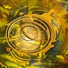
abracadabra
From the latest Magic week prompt (link should be in the site header, otherwise also at the end of this journal). The power flowed into him, filling his lungs, spreading out in his blood like oxygen, and settling into the marrow of his bones. He felt himself smile in a way that he hadn't since he was a boy learning to cast his first spell. He had devoted decades to the study of magic, but now, now he was magic. A glow lit the trees around him. He couldn't be sure if it was the setting sun, or if the glow came from his own skin. A beetle crawled on the ground nearby, seemingly unconcerned with what it had just witnessed, but yet its movements were in time with his heartbeat. A bird in the sky flapped its wings to the same rhythm. A breeze plucked at his hair and clothes. He began to dance, slowly at first; he followed the wind, and the wind followed him. He moved faster, twirling and leaping, until even the fallen leaves were dancing around him. When he stopped, all was
© 2007 - 2024 nichtgraveyet
Comments85
Join the community to add your comment. Already a deviant? Log In